This is mine and Erica's final draft of our video, we are happy with the final product
Tuesday 25 January 2011
Sunday 23 January 2011


Saturday 22 January 2011
Thursday 20 January 2011
Question 1
In what ways does your media product use, develop or challenge forms and conventions of real media products?
For the next section we decided to use an idea we got from a video by Weezer, where somebody has tops layered one on top of each other until they are wearing so many. We reversed this and dressed Miles in 9 t-shirts and at the end of each verse he removes it, this process has been sped up on iMovie so that it is in time with the song. Jo is dressed the same throughout and sings at certain times including the last line of the shot, we didn't want to change her appearance as often as Miles for this section as we thought it would detect the audience away from the main feature. We also chose to use a mid- shot for all of the above as so much was going on within the frame that moving the angle of the camera would be too much.
Shot 4
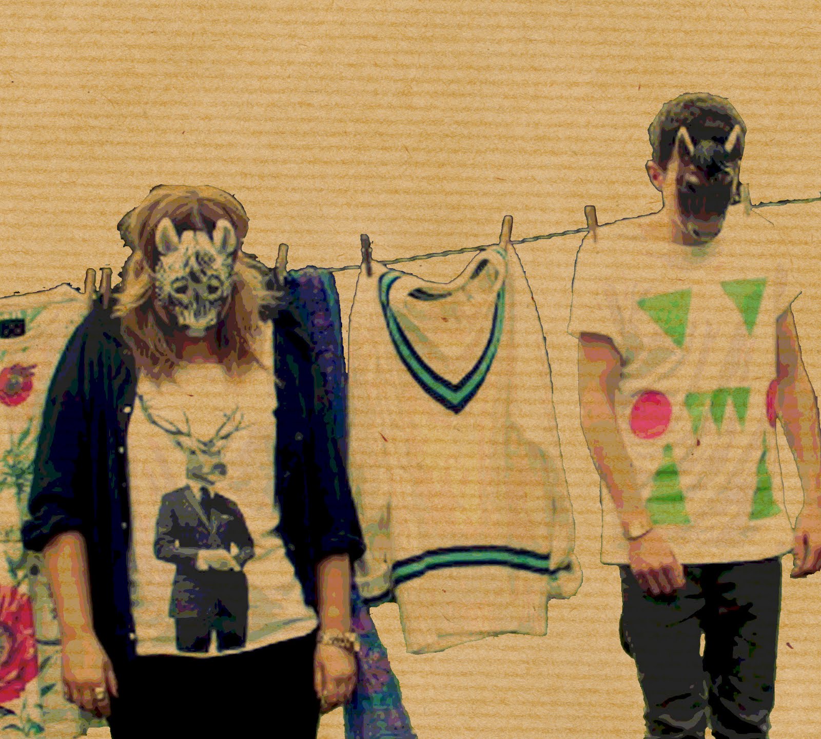
This is where the remix of the song kicks in, we decided for this section of the song to take inspiration from the video for Animal by Miike Snow, where there is a lot of outfit changing and stop motion as well as the use of various masks. This was also cleverly edited over a long period of time so that each shot fitted into the beat of the song, for example when they switch accesorries or they look from side to side, originally these were all photos that have been edited on Photoshop and then compiled together on iMovie and edited further. Also of the previous section had been set to black and white, which we use again towards the end to add a different element to the video. The use of the same room throughout is one that isn't so commonly used in music videos, but for this reason we decided it was appropriate for our video as we didn't want it to conform to all the conventions of other videos.
Shot 5
This is the last 24 seconds of the video where we use the same shot as the beginning to end. The shot up their bodies, this time un blurred and their heads following the camera up, and then them singing to each other. Their outfits are different to the start and it is black and white again as apposed to colour. We finally chose for the last shot for it to fade to white, this works well with the music and gives a professional finish to the video.
Digipak
Eval 4.
Eval4..
Poster
EVAL POSTER
Shot 1
The opening of our video starts with a section of stop motion where Miles shoes swap and the camera tracks up him to his face. This is also the first establishing shot of our male character so we wanted it to be clear and directed as we felt he was the main character throughout, we wanted his appearance to be obvious from the start also, this is why his hair is quiffed, he is wearing a nose piercing and has skinny rolled jeans on, this indicated a sense of his image and the feel for the video.
The opening of our video starts with a section of stop motion where Miles shoes swap and the camera tracks up him to his face. This is also the first establishing shot of our male character so we wanted it to be clear and directed as we felt he was the main character throughout, we wanted his appearance to be obvious from the start also, this is why his hair is quiffed, he is wearing a nose piercing and has skinny rolled jeans on, this indicated a sense of his image and the feel for the video.
Shot 2
The match-on-action of the remote shot to Miles and Jo standing has been edited smoothly so the relevance of the remote is obvious to the viewer. This is the first time the audience see's both characters together and the first theme of the video. This is where they split from looking at one each other and to breaking the forth wall and looking directly at the audience, the stop motion continues here, when the characters tops change frequently throughout the first verse. This was a channelling thing to continue as we were worried about them moving between shots and the shot being out of frame, to ensure this didn't happen we taped on the floor where their feet needed to be when filming, this was fairly successful.
The match-on-action of the remote shot to Miles and Jo standing has been edited smoothly so the relevance of the remote is obvious to the viewer. This is the first time the audience see's both characters together and the first theme of the video. This is where they split from looking at one each other and to breaking the forth wall and looking directly at the audience, the stop motion continues here, when the characters tops change frequently throughout the first verse. This was a channelling thing to continue as we were worried about them moving between shots and the shot being out of frame, to ensure this didn't happen we taped on the floor where their feet needed to be when filming, this was fairly successful.
After the first verse, there is a section where the beat drops and the music is a lot calmer and eerier. We had a few ideas for this 16 second gap, but decided that a blurred shot focusing in and out of them both stood expressionless, starting at the bottom and working its way up to their faces. This effect has been used in a lot of music videos under the same genre as this one.
Shot 3
For the next section we decided to use an idea we got from a video by Weezer, where somebody has tops layered one on top of each other until they are wearing so many. We reversed this and dressed Miles in 9 t-shirts and at the end of each verse he removes it, this process has been sped up on iMovie so that it is in time with the song. Jo is dressed the same throughout and sings at certain times including the last line of the shot, we didn't want to change her appearance as often as Miles for this section as we thought it would detect the audience away from the main feature. We also chose to use a mid- shot for all of the above as so much was going on within the frame that moving the angle of the camera would be too much.
Shot 4
This is where the remix of the song kicks in, we decided for this section of the song to take inspiration from the video for Animal by Miike Snow, where there is a lot of outfit changing and stop motion as well as the use of various masks. This was also cleverly edited over a long period of time so that each shot fitted into the beat of the song, for example when they switch accesorries or they look from side to side, originally these were all photos that have been edited on Photoshop and then compiled together on iMovie and edited further. Also of the previous section had been set to black and white, which we use again towards the end to add a different element to the video. The use of the same room throughout is one that isn't so commonly used in music videos, but for this reason we decided it was appropriate for our video as we didn't want it to conform to all the conventions of other videos.
This is the last 24 seconds of the video where we use the same shot as the beginning to end. The shot up their bodies, this time un blurred and their heads following the camera up, and then them singing to each other. Their outfits are different to the start and it is black and white again as apposed to colour. We finally chose for the last shot for it to fade to white, this works well with the music and gives a professional finish to the video.
Digipak
Eval 4.
Eval4..
Poster
EVAL POSTER
Question 2
Script
What did you hope to create?
Our main aim when making our music video was to make a video heavily based around our bands image as apposed to the music they create. We chose to do this as it fits with the indie/alternative genre of our band, in the last few years bands have taken to using their image as a selling tool in music videos unlike in previous times when a music video simply exhibited the band and them playing relevant instruments.
How did your research help you?
We started by looking at music videos we considered to use this theme within their videos and analysed them in terms of certain theorists. Then we moved on to picking a song and Audience profiling, this is where we thought very carefully about the type of person that would listen to the type of music we had chosen to use, I found a website called lookbook.nu which I had used previously for my AS work, there we found images of the people we chose. Then we pitched our ideas to the class and chose our actors, this helped as during our pitch we were asked who we were using in our video, this prompted us to make a quick informed decision. Next was a moodboard we created on Animoto of things that has inspired us so far, created a prop list and conducted more research into techniques we wanted to use in our video to get a clearer understanding of how we would work. After this we arranged a day of photos before filming so that we could decide on props and hopefully use the images for our ancillary tasks, we did this so that we already had images to work with. Another form of research that helped us was looking at existing bands websites, twitter and facebook pages as well as posters, this helped us stay on track and I keeping with our chosen genre. We regularly blogged about are thoughts and ideas throughout the research stage so that we didn't miss things out, I think this idea paid off when we handed in our final video and ancillaries
How effective was your music video as a whole?
I think that our final video was very effective in its aim, it had a basic narrative that worked well between the two actors and was relevant to the song. We used inspiration from other texts as well as our own creative ideas to give the video the most realistic, professional look. We both thought that the use of the Zebra, Horse and Panda masks throughout our work was the best idea we had. There are sections that I would alter if I went back, but nothing I would change dramatically.
What did you hope to create with your ancillary task?
With the ancillary task we wanted to make a poster and digipak that had a clear relevance to our video and our genre. We used the photos taken before and during filming to ensure this was obvious.
Digipak
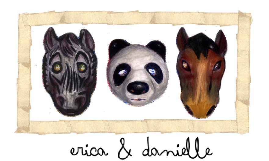
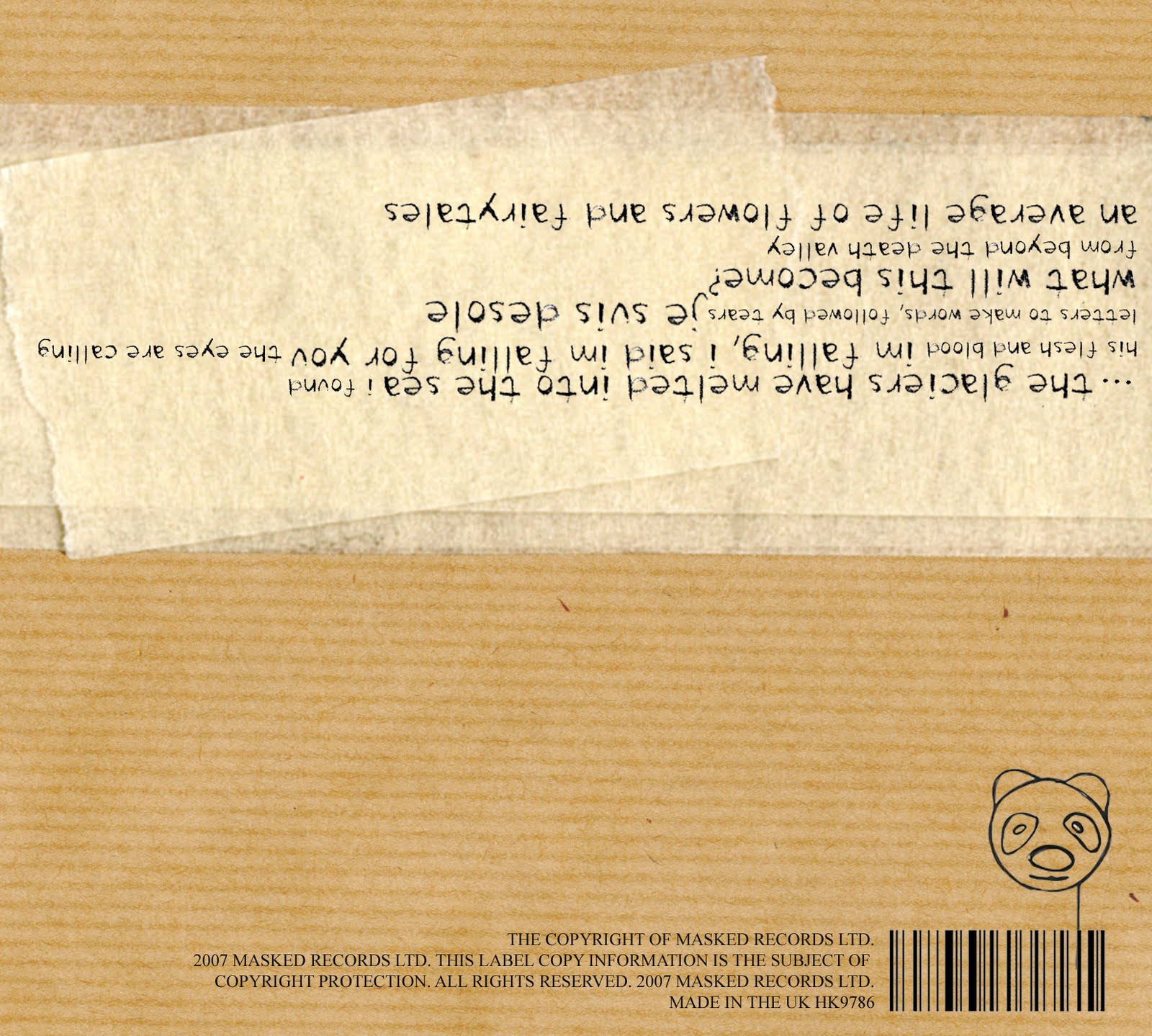
I thought that we should use the photo of the masks that erica painted into (at the top or our blog) to be on the front of the digipak we did this because we came to an agreement that it would be too cleche for us to use an image of Miles and Jo (our actors) on the front as this didn't fit with the image of our band. The decision to have the band name on the filp-side as apposed to the front also came from other existing digipaks. the picture behind the disk was an easy decision, if we were to use and image of the two, it would be there. The back was my idea to have the text upside down to the right of the digipak on top of the other continousing theme of masking tape, this was used to make our work seem handmade and different. The barcode idea used here was taken as inspiration from Esquire magazine as a feature they use. While our digipak is basic, I think it is effective because of the informed decisions we have made.
Poster
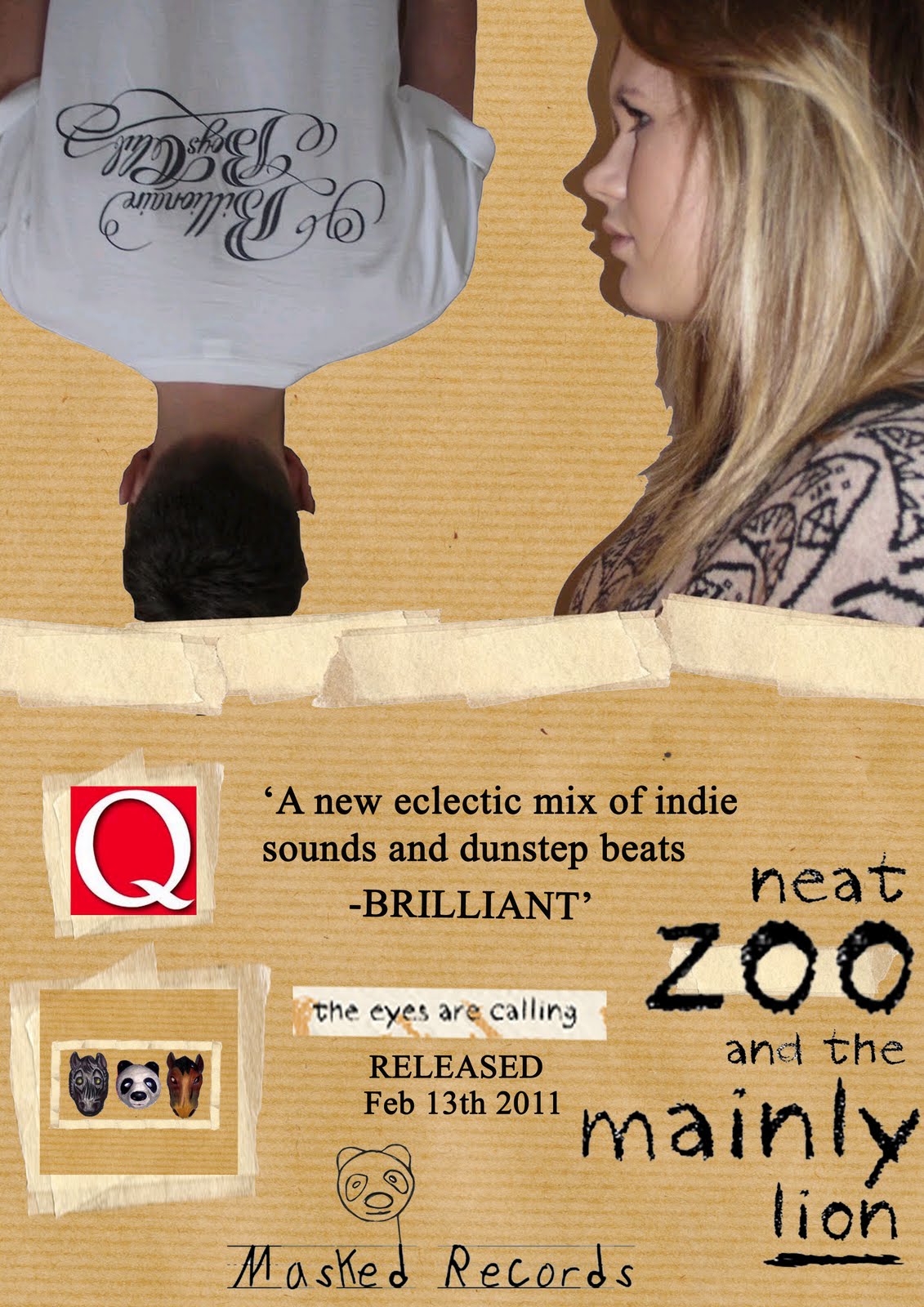
Our poster made to advertise the album was taken from an earlier idea we had back at the beginning of the course. We used test shots of Miles and Jo looking plain and simple, very opposite to the video. The tape, text and paper backing was used again here to keep the continuous themes flowing throughout our project. The Poster features commonly used things like quotes from music magazines and smaller images of the cover of the CD, we knew this was a good marketing strategy because we have seen it in real products prior to designing our own.
Is there anything you would change?
Yes, there is always things you would change given the opportunity. If we did, I would consider the beginning of the video again and plan it in more detail, I would also film our frames a lot more and make sure they are securely focused. We would set more time aside for editing than we did as we didn't realise it would take us so long, even with 200 stills. In terms of the ancillaries, I am fairly happy with them and wouldn't consider many changes as we carefully selected the ideas we used unlike the video were we just went with the flow of things.
Question 4
How did you use media technologies in the construction and research, planning and evaluation stages?
Question 4
View more presentations from Dhag.
Tuesday 14 December 2010
Evaluation
1. In what ways does your media product use, develop or challenge forms and conventions of real media products?
2. How effective is the combination of your main product and ancillary texts?
3. What have you learned from your audience feedback?
4. How did you use media technologies in the construction and research, planning and evaluation stages?
2. How effective is the combination of your main product and ancillary texts?
3. What have you learned from your audience feedback?
4. How did you use media technologies in the construction and research, planning and evaluation stages?
Monday 13 December 2010
Wednesday 1 December 2010
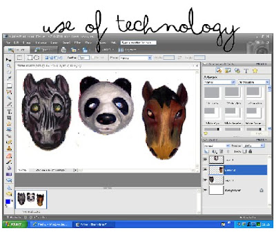 Throughout the production and research of mock digipaks I have personally chosen to use photoshop elements as it allows me to edit very precisely and creates a very proffesional effect as it is a commonly used programme in the media industry.
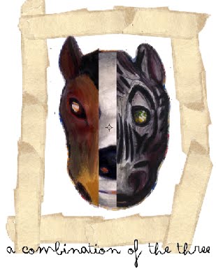 Here I have experimented with the use of all three of the painted masks combined to make one image, the outcome has been unsuccesful in my view although i think that furthur editing of the image to make it look more abstract could result in a very strong image that could be used on the front cover of the digipak. I will experimant with this idea at a later date and hopefully a postive outcome will mean that it may be used somewhere within our final work.
Tuesday 30 November 2010


I scanned in this newspaper article as i thought it may give the image a homemade effect and also an artistic one. One way i could use this image would be the place ti entirely over a picture and then change the opacity so that the image below it is visable, this may give a surreal effect which would fit in very well with the whole abiance of the video.

I used a camera to capture this image of paint instead of a scanner so that i could leave the paint wet, I believe that this image would give the cover an almost 3D effct and would obviously tie in perfectl with the artistic theme, teh colour red may be to vibrant, i could combat this problem by either editing the colour on photoshop or taking a new picture of a more neutrally coloured paint.

 The image that I have scanned in here is parcel wrap, wnother image that works wonderfully when the opacity is turned down, this creates a much softer and almost mistier colour which would again work well in showing off the three masks which i hope will be used on teh front cover of the digipak.

I used a camera to capture this image of paint instead of a scanner so that i could leave the paint wet, I believe that this image would give the cover an almost 3D effct and would obviously tie in perfectl with the artistic theme, teh colour red may be to vibrant, i could combat this problem by either editing the colour on photoshop or taking a new picture of a more neutrally coloured paint.

Masking tape has been an obvious theme that has ran through the mock-up digipaks that i have created, I believe that the colour of this is a wonderful background to the masks as it really intensifys the vibrancy of the colours within the three pieces.
 The image that I have scanned in here is parcel wrap, wnother image that works wonderfully when the opacity is turned down, this creates a much softer and almost mistier colour which would again work well in showing off the three masks which i hope will be used on teh front cover of the digipak.
 Whilst using Photoshop for production of the mock digipaks I have come across alot of effects that may fit in well with the artistic theme that will hopefully be communicated to the audience through the use of imagery on the cover and thrughout the whole digipak.


I created this digipak on photoshop with the use of a few items i scanned into teh computer such as; newspaper, masking tape and teh three masks that I painted,i think that the combination of this pieces has created a handmade effect which ties in very well with the artistic theme that runs throughout the music video. this is also a style we can carry through with the poster also.


Monday 29 November 2010
Poster
This is the wikipedia definition of a Poster.
A poster is any piece of printed paper designed to be attached to a wall or vertical surface. Typically posters include both textual and elements, although a poster may be either wholly graphical or wholly text. Posters are designed to be both eye-catching and convey information. Posters may be used for many purposes. They are a frequent tool of (particularly of events, musicians and films), and other groups trying to communicate a message.
A poster is any piece of printed paper designed to be attached to a wall or vertical surface. Typically posters include both textual and elements, although a poster may be either wholly graphical or wholly text. Posters are designed to be both eye-catching and convey information. Posters may be used for many purposes. They are a frequent tool of (particularly of events, musicians and films), and other groups trying to communicate a message.
Friday 26 November 2010


Wednesday 24 November 2010
digipak idea
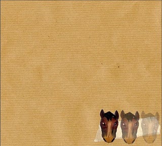
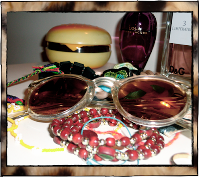
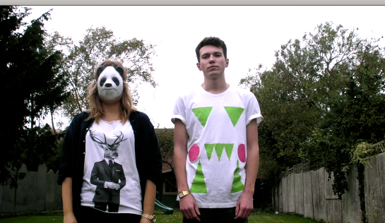
This was an idea I had for our front cover of our digipak. It is just a random photo I took, however it does include the sunglasses we have used for part of our video and the animal print background. After discussion with Erica we decided that this may be ok for inside the digipak but for the cover it doesn't work.

Tuesday 23 November 2010
Idea for cover
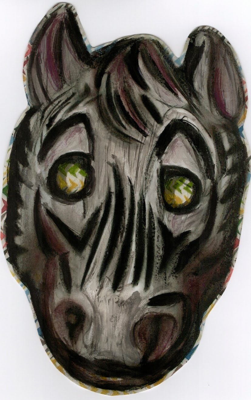
This is a picture of the mask we use throughout our video that Erica painted into with watercolour in todays lesson, I then scanned it in to my laptop and uploaded it here to show how we plan to create an interesting front cover with an artistic random element to it.

Teacher feedback
a massive improvement on the first version. the video has a sense of style and makes much more sense. simplicity is everything here, the images match the music really well. i'm intrigued to find out what you are planning to use in the 2 brick wall sections. camerawork is appropriate to task, editing works very well - particularly in the stop motion (clothes swapping) sequence. lighting is a bit dodgy towards the final part of the video as i previously told you, but is good for the majority of the time. your 2 characters fit the genre of video (and music) really well and have enhanced your piece of work. the mise en scene is very simple and very effective. you have managed to communicate a real sense of purpose with this piece of work. this is in the level 3 band at the moment.
Monday 22 November 2010
More inspiration
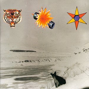
These dont necessarily look like album covers, however they are. I want on amazon and types 'the xx' into the search box, I then went onto featured items and found these. They are all by different bands.
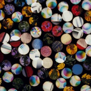
This is another cover that is like an illusion is it very abstract and if you look at it closely it moves! I think this is a bit extreme in terms of how different we want to be with our cover but id did still inspire us.

This inspired us because we did think about using a range of images and this cover does that really well, it is really random but still effective and would be eve-catching on the shelf of a CD store.
This the debut album from Foals also doesn't have text however it isn't as abstract as some other ones we have found. It is still a good cover though and if we decide not to use the hand drawn style for our cover I can see us producing something along the same lines as this.
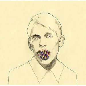
This is my favourite one is the one with the exclamation marks, it looks like it has been hand drawn and then manipulated on the computer, which is similar to what we were thinking of doing.


This inspired us because we did think about using a range of images and this cover does that really well, it is really random but still effective and would be eve-catching on the shelf of a CD store.
This the debut album from Foals also doesn't have text however it isn't as abstract as some other ones we have found. It is still a good cover though and if we decide not to use the hand drawn style for our cover I can see us producing something along the same lines as this.
This is my favourite one is the one with the exclamation marks, it looks like it has been hand drawn and then manipulated on the computer, which is similar to what we were thinking of doing.

Digipak
Within our Digipak myself and Erica have decided to create the front for , spine and back of the digipak as well as a band information section and possibly a band free image to ensure the product is as convincing as possible and shows how creative we can be as we are using a fairly plain image for the front
Digipak idea
This is an example of a cover that we do not what to produce the ideas of using Jo and Miles on the cover is not one we are interested in, we think this is very cliche and is very obvious for a CD cover, to continue the random theme we have produced so far we are going to use an image or range of images on the front of our cover with no text as this again shows how our band is all about their image as you would then expect fans to recognise the digipak without the name and title on the front.


Weezer- Pork and Beans
We have been advised by our teacher to add this video to our blog as it shows the shots of the mans tshirt changing and it is similar to a scene we use in our video where Miles tshirt changes.
Friday 19 November 2010
Tuesday 16 November 2010
Fonts for digipak
When looking for fonts I looked at a website called which I used and I assume Erica used for our magazine covers last year. It was really useful last year so i thought it would be a good place to start this year. When on the website I went straight for 'Scripts' and handwritten, I chose handwritten as me and Erica have discussed having an arty, handmade feel to our digipak and I figured these fonts would be most suitable for this.
Below were what I found to be my top 5 favourites.
Pastel Crayon,

Trash Hand,

Markus Ink,

Lauren C. Brown,

Lush.

Below were what I found to be my top 5 favourites.
Pastel Crayon,

Trash Hand,

Markus Ink,

Lauren C. Brown,

Lush.

Possible CD front covers
 These are a few images I have taken a screen shot of from the filming we have so far. I have done this so that both myself and Erica can make moc-up digipaks. To make our work as professional as possible we will do another photo shoot next week for the digipak as you wouldn't usually see an image from an artists video on the front of their album.
Subscribe to:
Posts (Atom)